So recently I attented a visit to the studio of Adrian Heapy in Belper, Which had been organsised by my tutor Steve Davies, who used to work for Adrian.
At the time of the visit Adrian was in the process of building a bedroom set, which was going to be used to take shots of many different beds for a bed manufacture.
Adrian kindly let us students interrupt his day so we could look round his studio and ask him questions about the industry of photography.
He has got one of the best attics ever!! it is full of so many props I can't list them all on here, but to mention a few would be toys, Vase's, lights, plastic mouldings, cushions, materials, signs and the list goes on and on.
I took a few shots of various parts of his studio and they can be found below.
So above there is shots of the smaller area where they do product and model Photography, (1st 3 photos and the last one 9above)) then there is the type writer in his office, (4th photo) all the other images are of the bigger studio area, the set being built, one of the lights he uses and all the bits of wood, tiles, fire places etc, that they keep for set building.
I really enjoyed the day and a half that I spent there, Adrian is a very passionate man, knows his stuff about business and clients, which after 40 years in the business is not surprising.
I learnt that to be a true professional photographer, you have to also be business minded, and a good DIY person, as sets don't build themselves and it's not always cost effective to get in contractors.
If I get the chance to go again I would be there in a shot.
His website can be found at the following link. http://www.adrianheapyphoto.co.uk/
Wednesday, 30 November 2011
Saturday, 26 November 2011
Location Portraits - Jewellery Editorial
This video shows the photography shoot of 2 models and lots of Jewellery, I can hopefully use this video to take inspiration for my shoot and how to use the Jewellery that I will be provided with.
In this video, 1 model has lots of Jewellery, rings on most fingers, 2-3 necklaces, whereas the other model has just 1 necklace, a couple of rings and bracelets.
Saturday, 19 November 2011
Theme 2 Studio shoot planning.
So for my theme 2 shoot I am going to be doing Advertising/Fashion.
I will be using at least 1 model and various different outfits and Bags/Jewellery.
I will again be using my Sony A300 with the standard 18-70mm Lens, The lighting on my last shoot ended up being 1 light, with a beauty dish and a honeycomb centre, pointed straight at the model and shooting from underneath. This time though I think I may change the lighting depending on the shot I'm going for, I would of thought at least 2 lights will be used this time, maybe even a third to light the background, positioned behind the subject.
I will be using simple plain backgrounds, mainly white, but I may also try a black background, if time allows. So ideas for shots i will try to get are shown below.
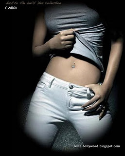
I think I will start with Jeans and T-shirts, which could be merged into the same photos, but then also concentrating on them in their own forms.
For example, in the Jeans/T-Shirt shoots I could do a full body shot to show off the 2 items, or I could do a close up shot of just the Jeans cutting off the image just above the waist line.
I will hopefully get time to use a variety of different poses, angles and crops.
So the above 3 images are good examples of shots I could do which concentrate more just on the T-Shirt.
The above shot is one I would like to try, maybe towards the end of the shoot if time allows, as this is looks a grey background, with just the 1 fairly harsh light pointing at the model. This could take some time to set up after having shot with several lights and white background/boxes/props etc.
I will then move onto incorporating jewellery and/or bags.
When it comes to incorporating a bag or some form of jewellery, be it a Necklace, Ring, Bracelet, Watch or a combination of a few, the shots can then again be close ups on a hand holding a bag or a full body shot with the model holding the bag, showing the perspectives of the bag.
This image is the only good one I could find for Vivienne Westwood advertising, again although it is a head/shoulders shot, the chunky necklace in this image stand out well, I could try this but the background would be more plane, but the option of Editing in a background would be there if I shoot it ona simple white background.
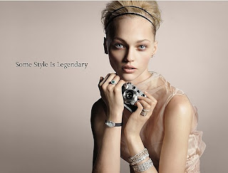
I like this pose, again it has the head and shoulders of the model in, but there is a good sense of focus on the jewellery around the wrists.
The above 3 images are all from Tiffany & Co. advertising campaigns, although the model is the main subject in all 3, the product is still in there as well and I will try and incorparate this into the shoot and try some similar shots.
This image is the only good one I could find for Vivienne Westwood advertising, again although it is a head/shoulders shot, the chunky necklace in this image stand out well, I could try this but the background would be more plane, but the option of Editing in a background would be there if I shoot it ona simple white background.
I like this pose, again it has the head and shoulders of the model in, but there is a good sense of focus on the jewellery around the wrists.
The above 3 images show different poses/positions for bags that could be replicated in my studio shoot. I think if I was to copy the bottom image though I would be tempted to include all of the models head.
Monday, 14 November 2011
ELLE Elletv - coco rocha by david vasiljevic BEHIND THE SCENES
This video is from an Elle Uk photo shoot, but it is the only video I can find that features David Vasiljevic and it would appear to be more about the model Coco Rocha.
It doesn't give any real clues as to how David works on shoots, but again I think this has something to do with this shoot being a 25 year celebration shoot, which took it's inspiration from a 1960's film and is more like a film shoot than a photo shoot.
David has also worked on Levi's Shoots.
Saturday, 12 November 2011
Theme 2 Statement of intent.
Intentions/purpose of the photography to be undertaken
My intention on this shoot is to do some more studio work, this time in an advertising style to run along side my other work for this cause.
Reasons for selection of the theme (including inspiration from the work of others)
The reason for selecting this theme is that the images I intend to take will again be studio shot, with a model and with the objects to be advertised. This means they will run along side my other theme of work that I have already done.
Inspiration for these will come from the some of the photographers I have used for my research, a couple of these would be Richard Warren and Julia Kennedy.
The photo equipment and medium that will be use and why
I will be using the College Studio for the shoot, my camera a Sony A300 with the standard 18-70mm lens. I think either a black or white background will be used, as this will help make the model and the product stand out.
The lighting will be either from the front, and or have the background lit up as well to add a extra effect to the images.
Techniques that will be used and how they help convey the visual message
I will use different ranges of Depth of field, to help make the model and the product stand out. I will also play with different positions for the lights, to give different effects on the background. I will also use different zoom lengths to allow me to position the model and product in a number of different ways.
How light quality will be applied and controlled to help convey the visual message.
I will apply the light in various different ways from different positions for different effects, depending on the subject being photographed at the time.
I may also light the background to again make the model and subject stand out.
Risk and health and safety considerations
There are a number of things to consider when shooting in a studio, it can often be dark so people need to be aware of equipment around them. This in itself has numerous issues, tripping over cables/stands, burns from heat coming off the lights etc.
Another thing to consider is the poses that the model will be holding and the length of time that they will be holding them for, as this can cause muscle fatigue/strain.
Theme 2 Studio shoot research.
So for my second Theme I have chosen fashion/advertising.
I'm going to try and do a shoot with Models in the studio, simple backgrounds and 4 separate mini shoots, being Jeans, T-Shirts, Jewellery and Bags.
These 1st 3 images are all for the same company and use 2 models but 1 bag, Not sure if I will use this method or not, I think the images below, using just 1 model, but with the bag in different positions looks better and less distracting from the product itself.
The above images show how a black background could also work well with a single model and the "products" that I'm trying to shoot, show and advertise.
The above image is a good example of how the Bag/Jewellery could be combined, although the model is dressed, the position of the bag and her hands hide the clothing so the main focus is on the bag and the 2 Bracelets.
This image is a prime example for a shot that combines more than 1 of my chosen subjects, The yellow dress could easily be change for a pair of Jeans and a T-Shirt, and then you would still have the big bag and the big ring on her finger, and also a Bracelet could be added to the wrist as well, or on the dress in this image there is some detailing, which, if the dress was to be replaced a Necklace similar to the detailing could be added.
These photos above show how a combination of 2,3 or 4 of the items I intend to use in my shoot can be put together. The top image, has pretty much every aspect in there, the Jeans (shorts in the picture), the T-Shirt (the top in the picture), the bag, and Jewellery are all present.
The Bottom left image has for the main bulk of the image, 2 of the items, the T-Shirt (the top in the image) and the Jewellery.
The bottom right image has potentially, 3 items, The Jeans (denim shorts in the image) the T-Shirt (the blue top) and the bag, also with the position of the models left hand/wrist could also have a watch/Bracelet.
This image shows a good representation of how a full body shot could show off the outfit (which in my shoot will be Jeans and T-Shirt), and the Jewellery.
This image would again be a good pose to use, not only will I be able to include every aspect of the shoot, it also allows a closer frame than the previous image. With the position of the hand and the use of the box as well I would also be able to do a close up shot of the bag, crop it just above the wrist, therefore showing off the Jewellery as well.
One of the many Photographers who have shot for Levi's Jeans is David Vasiljevic his website can be found here: http://www.davidvasiljevic.com/ and follow the link to the advertising pages.
http://acquaphoto.com/blog/2010/03/bella-legs-look-book-2010-fashion-photography/
The above link takes you to some product photography for a company called Bella Legs, the product is the leggings/leg warmers, to show off the range and versatility of the product, they have done multiple outfit changes and thy are all full body shots, in order to show off the full outfits that the product has been put with.
This is just one of the many shots on the link, and it i close to the sort of studio work I will be doing, simple white background, main focus on the model and the "products" she is wearing, fairly tight frame to keep the attention on the model.
The above 2 images are agin the style of shots I will do in the studio, simple plain backgrounds, focus/attention on the models and the "products" she is wearing, I like these 2 images together as it shows the difference between colour and Black and White images, as it is the same model in the same outfit, just a different pose.
These 2 images show how close up's of the actual products also work well/better on a model than just on a white box. Again the black and white images give them another dimension to the colour which I suspect wouldn't have had much more colour in them anyway.
This is a perfect example of the kind of image I will be aiming for in my studio shoot, 1 model, simple lighting, simple pose.
More images like this can be found on the website I found this one from, which is http://somaphotos.com/blog/?p=723
The other option for Jewellery is to do close up shots of it, but again still on a model, much like the xample below. The basis is still much the same, well lit and against a simple background.
Friday, 4 November 2011
Theme 1 Research 5 Richard Warren
The final person I have chosen for my research is Richard Warren.
His website can be found here http://www.richardwarrenphotos.com/ or his flash site http://www.newyorkfashionphotographer.com/swf/splash.htm
Richard is a fashion Photographer based in Manhattan, Born in Houston Texas, He moved to the Pacific Northwest at the age of 15, and later on gained a Degree in Graphic arts, from the Western Washington University.
By the time he was 21, he had moved to New York, and assisted other Photographers such as Bill King, Helmet Newton, Denis Piel and Robert Mapplethorpe.
He has worked allover the world in places like Milan, Paris and then to Sydney Australia, to work for Australian Vogue, Dolly and Australian Harper's Bazaar.
Richard returned to New York in 1990, Most of Richards work is Advertising/Magazines, and this shows in his work I have chosen to research, as there is often spaces left at the sides for writing, or there are 2 photo's to make 1 image.
So in this 1st image there is both a colour and a black and white photo. Both shot in a similar way, with a heavy contrast of the model, who is also the main focal point, being well lit, and the background being not so well lit. This I think has been done on purpose, to make sure the model is the main focal point. Obviously the image on the left is in colour, though still has a limited range, though the reds in the Bra and Knickers instantly grab your eye.
The image on the right has a fairly varied Tonal range, from whites to black and many shades of greys in between. The main focal point of this image is, (due to it not being in colour) either, the models facial expression, or her hand around her lower regions, think it's more the face, and then the arms lead you down the image.
Both framed quite tight to make sure that the model is the main focal point.
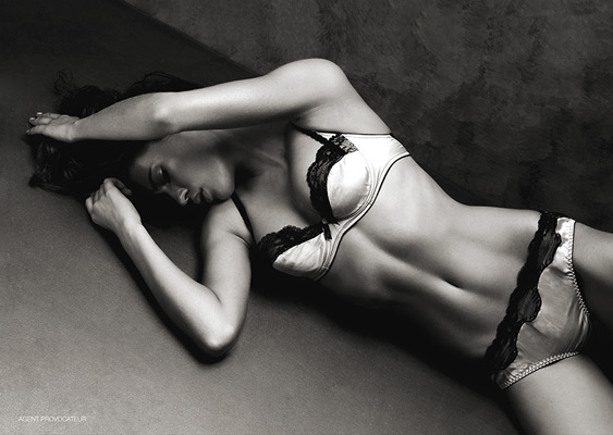
So this image is different, due to it being just one photo, black and white so no use of colours, though like the black and white image before, it does have quite a soft light, making the Tonal range quite varied, again from the bright whites of the bra, to the deep blacks also on the bra, these Blacks on both the Bra and Knickers really stand out, grab your eyes and they become the main focal point, as I assume this would of been a fashion shoot about the underwear.
Again quite a close crop/Frame to the image, i think that the way the model cuts through at a diagonal gives it a different yet appealing look, and I think the Connotation/Denotation of this image is very much "Sex sells" due not only the fact that it's a woman in underwear lying down, but also the expression on her face seem to lead the train of thought that way.
This image is 2 Photo's both in colour. The range of colours is fairly wide, there are Whites, Blacks, Blues, Yellows, Purples, Pinks etc.
The Framing of both of these images is wider than the previous, to allow you to see the props that the model is holding/has around her, yet still tight enough to make sure that your attention is centred on the model and what she is doing with said props.
Not entirely sure what the Connotation/Denotation of these images is, if there is any at all, as again they were probably taken for a magazine/Advertising campaigns.
Depth of field in both images is middle of the range, so the model in the foreground is in focus, but also the walls behind in the background, are not completely out of focus.
This image is again in colour with a wide range of colours, Blacks, Creams, Whites, Blues, Purples, and even a tiny bit of yellow on the models fingernails.
Again I would say this would of been taken for a fashion shoot/advertising, so the focal point is on the model and the dress that she is wearing, with another Denotation of sex sells, with the model having something in her mouth, and blowing on it and there being a bed in the background.
The framing of this image again even wider than the previous images, and I think this is to allow the whole of the dress to be seen.
Even though there is a wide frame the Composition of the image is still a simple one with only a few things making up the complete photo, but there is a use of 3-4 different textures.
This image is again 2 photos together to make 1 photo, this time both are in colour, though the blue lighting makes them almost look black and white, and narrows the Range of colours. The range is white, black, blue/ grey and then the models skin tone.
I think using the table as a prop has given the images a use of lines and angles, in the image on the left there is the table, the line between the floor and the back wall, and then models arms and 1 leg are straight, and the other leg bent at just over a 90 degree Angle, giving 2 more lines.
Then the image on the right again has the table and it's leg creating 2 more lines and a 90 degree angle, the models arm is bent to a similar just over 90 degree again, and her hair is also hanging straight down, with the white high lights creating yet more lines.
Both images again use a middle to deep Depth of field, in order to allow the model to be in focus and the main focal point, but the detail/pattern in the back wall is also in focus.
The composition of these to images, isn't very complicated, but the mix of the colour in the hair, the table and the detail on the background wall give it more composition than the photos below.
Again 2 photo's put together to make 1 Photo, the composition of these is a lot more simple than the other photo's I've looked at from Richard. just a plain white background, shot with a light either side of the model to produce 2 points of light.
The framing again is simple, definitely no use of the Rule of Two Thirds, as the model is middle front in both images. Again I would say shot for a fashion magazine or advertising campaign, so the Denotation is again Sex sells, and the images are all about the underwear/clothing.
The image on the left is cropped closer to allow you to see the detail/colours in the dress, where as the image on the right, has a different perspective, cropped wider, to allow the legs/stockings to be in shot. Both however again due to the nature for which the images would have been shot, make sure the model is the main Focal point.
This photo is Cropped/Framed much much closer than any of the previous images I have looked at from Richard. The framing has a banner of grey to the left, which I assume is to write about not just the jacket, but maybe also the Hair/Make-up, as the image is cropped closer around the models face.
Not a massive Tone/Colour range, 2 different shades of Grey, the colour of the jacket, which is also close to the models hair colour, and then the models skin tone and whiteness to the right of the models face.
Not sure if there is a Connotation/Denotation to this image, this one to me doesn't really use "sex sells" to me.
I would say there is a slight use of lines, with the line between the border on the left and the grey background, the line down the side and the sleeve of the jacket, and the curved line of the collar around the jawline of the model.
This image is again framed like the previous image, with a border to the left,more than likely for a write up on all the different components of the models outfit. Cropped wider to allow you to see all the components and the different pose used. I think due to lack of any stand out colours, Richard has used such a pose to really make the model stand out from the plain darkish background, and to grab the attention of the viewers eye. There is again little Colour or Tonal Range using just Whites, Blacks, Greys and the models skin tone. I would again say there is a use of lines, with the model having one leg up in the air, there becomes 4 lines (2 arms 2 legs) coming off the main body/middle of the image, all of which are leading out to the edges, I think this helps make the Composition a little more complicated, than just model stood up against a background.
This image is again 2 photo's together, but they have a massive difference in both the Crop, Contrast and the perspective. The one to the left is a wider crop, to allow the viewer to see the clothing, hat, neck wear, hair/make-up. Where as the one to the right is cropped a lot closer, to concentrate the main focal point to just the eye/make-up around the eye. The image to the left has a much brighter contrast using bright white clothing, and a White/light Grey background, with only the Black hat and neck wear to stand out and contrast it. Whereas the one to the right, Probably used the same background, but because the image is zoomed in more, the background has become darker and at the top of the image the hat is present, also causing a dark area, using just the models face as a contrast.
This is the final image I have chosen from Richard, It varies from the other as there is a lot more to the composition, there is the model, the puppet she is holding, the rug, steps, curtains. There is a fairly wide Tonal and Colour range, from the different colours on the puppet, and the rug. The contrast is well balanced, with no harsh or deep shadows or highlights. I think the main focal point is the Puppet, with the head looking at the model, this draws your attention to her and again the clothing she is wearing.
This image is also one that uses a few different textures, there is the rug, the wood of the puppet, and also the models skin.
I think there is a use of lines in the image. from the stripe of white down the centre of the top, the straight lines of strings, and then the lines of the legs and arms.
I think Richard as a general rule likes to use a studio, fairly soft lighting, simple compositions and props.
Subscribe to:
Posts (Atom)