Julia Kennedy is a Fashion, Editorial Photographer based in London, who has worked with many different Celebrities, worked for many different companies and multiple magazines.
To name a few would be Elle UK Magazine, The Glass Magazine, Grazia India, Twenty 6 Magazine, The BBC, ITV and Five, the TV channels for advertising/Commercial work, The Black Eyed Peas, Fergie, Natalie Imbruglia and Chrissie Hynde.
Julia Graduated from Manchester Metropolitan University in 2000, before moving to London to follow her career as a fashion photographer.
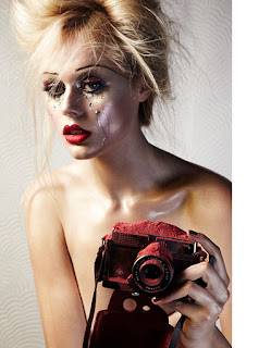
This image has a fairly deep depth of field, not only is the camera and model in focus, but the slight pattern in the wall behind can be made out.the tonal range is quite varied blacks, whites, reds, silvery green (around the eyes) various tones of the skin.
It has a fairly simple composition, being the model, camera, make-up, plain background and the powder on the camera.
I think the main focal point would definitely be the models face and the make-up before your eyes move down to the camera covered in the red powder. In order to keep the model the focal point the crop is tight on the model. The above image is a bog contract from the previous image, it has a much more complicated composition, with lots of props on the table to the front right, 3 models all dressed in different textured dresses, and highly detailed walls in the background.
The range of colours is vast, reds greens, blues, whites, oranges, golds etc.
The contrast/brightness of this image is very high with little shadows, and the shadows that I can see are not dark black, but more grey in colour.
There are many different shapes in the image, which all help add to the complexity of the composition. Likewise there are also a lot of textures, the wood on the stone walls, the different materials of the dresses and chairs, the plastic items on the table and even flowers.
I think this image is a good example of shapes, to me there is a use of triangles, from the arms on either side being symmetrical, each creating thee own small triangles, to the models legs, which again seem to form a triangle as the slope down and in from the hips to the crossed over feet. Even the necklace to a certain extent comes down from around the neck to a point forming a small triangle.
the composition is again fairly simple, plain background, model, clothes and jewellery.
The tonal range is limited with the only colour really coming from the green top and blue earrings and shoes.
Not a really tight crop, this allows for the whole of the model to be the focal point, rather than say, the top or the earrings, the hair etc.
The framing of this image is very good, using the mirror as the frame within the image, and using a very shallow depth of field, to make sure the surrounding areas are not in focus at all, the main focal point becomes the model (s) in the mirror.
The tonal range is limited with it being a black and white image, and I would say it has a mid range contrast, with there being equal light greys, whites, blacks and darker greys.
I think the composition is fairly simple, but it looks like it may have been busier had the bulk of the image not been out of focus.
in my opinion there might a be a denotation of "image counts" as well.
This image has a slightly darker contrast than the previous image, mid range brightness, with more darker areas than light helping to contribute to this.
Although the background is quite detailed I would say the actual composition of the image is still quite simple, 2 models a bike and a background.
It has a tight crop/frame, cutting of bits of both models, I think this is to make sure that the detailed background doesn't take your attention away from the models.
I think again the Denotation of this is "image counts" as it looks like a fashion shoot.
There is a small range of textures in this image, from skin, to fabrics of the outfits, to the brick walls, glass in the wooden windows and tarmac floor.
The depth of field used here is mid range to fairly deep, as both the models and the background are all in focus.
The main focal point in this image is model, not only is she doing something (climbing the ladder), but also her bright clothes stand out from the darker background and that instantly grabs your attention.
The detailed walls of the building in the image make for a busy composition, even though it is still made up of essentially 3 parts.
The framing/crop of this image is wider than the previous couple, but I think this has been done to show the perspective, that the model isn't just standing against the wall, but actually climbing the ladder, which could also be the Denotation/Connotation of the image, "climbing the ladder to success".
It's a fairly bright image, with a fairly even contrast, which means even the dark areas on the walls are quite light.
This image has a varied range of colours, light blue sky, green grass, white walls and roof of the van, orange on the van, then the multi-coloured outfit that the model is wearing.
There is also a good range of textures, again from all the above mentioned things, we have a metal van, 2 different types of materials on the model, rocks, grass, the road etc, all of the above, make for a good composition, busy but again not overly complicated.
It has a mid range depth of field, both the model and the van are in focus, but the background is very slightly out of focus.
This image is a change from the last few I have looked at, for a start off it looks to have been shot in a studio rather than on location.
Using the dark bed/sofa and carpet gives it a darker feel, but also helps to make the bright red dress and blue shoes stand out.
The contrast is also darker, with a well pronounced shadow behind the models head, from the bright light being pointed at her, which is almost making her hair/face bleach into one.
I think there maybe a use of lines in the image, both her legs, which I also think are the main focal point, lead you up to the rest of the model, Then there is the line of the prop she is sat on, running pretty much straight through the image.
I think from the fact that her legs are the main bulk of the image and that you can see the top of her stockings, the Denotation of this could be "sex sells".
With it having been shot from above, gives a different perspective and helps to make the models legs look nice and long, and to keep the legs in focus the depth of field has been kept deep, so the models face, which is closer to the camera than the prop and her legs, is still in focus.
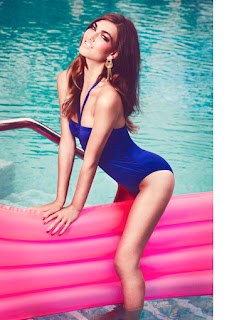
This is a nice bright image, bright colours and little shadows. There is quite a good tonal range with all the different colours found in the image.
The depth of field is fairly shallow, the model, the lilo and hand rail are all in focus, but the water in the background is slightly out of focus.
The frame has been left slightly wider to allow the pool to be in shot, yet the model remains the main focal point. The composition again is simple and uncomplicated.
I would say there is a use of lines in this image, there are the white lines of the steps in the pool, the lines in the lilo, the hand rail, the models arms are perfectly straight and her legs aren't to bent either.
This image appears to be more complicated than it is, the composition is essentially made up of the sea, the boat and the model, but with all the different parts of the boat in shot it makes it look busy.
It is a fairly bright image, with really only 1 shadow on the seat being created by the model, but even this is a light shadow. There are a few different colours, whites, blacks, blues, reds, purple, brown and the skin tone of the model.
With the model being mid ground in the image the Depth of field has been kept deep, allowing the surrounding parts of the boat to be only very slightly out of focus.
The main focal point is the model and again I would say a Denotation of "sex sells" could be taken from the image.


No comments:
Post a Comment