His website can be found here http://www.richardwarrenphotos.com/ or his flash site http://www.newyorkfashionphotographer.com/swf/splash.htm
Richard is a fashion Photographer based in Manhattan, Born in Houston Texas, He moved to the Pacific Northwest at the age of 15, and later on gained a Degree in Graphic arts, from the Western Washington University.
By the time he was 21, he had moved to New York, and assisted other Photographers such as Bill King, Helmet Newton, Denis Piel and Robert Mapplethorpe.
He has worked allover the world in places like Milan, Paris and then to Sydney Australia, to work for Australian Vogue, Dolly and Australian Harper's Bazaar.
Richard returned to New York in 1990, Most of Richards work is Advertising/Magazines, and this shows in his work I have chosen to research, as there is often spaces left at the sides for writing, or there are 2 photo's to make 1 image.

So in this 1st image there is both a colour and a black and white photo. Both shot in a similar way, with a heavy contrast of the model, who is also the main focal point, being well lit, and the background being not so well lit. This I think has been done on purpose, to make sure the model is the main focal point. Obviously the image on the left is in colour, though still has a limited range, though the reds in the Bra and Knickers instantly grab your eye.
The image on the right has a fairly varied Tonal range, from whites to black and many shades of greys in between. The main focal point of this image is, (due to it not being in colour) either, the models facial expression, or her hand around her lower regions, think it's more the face, and then the arms lead you down the image.
Both framed quite tight to make sure that the model is the main focal point.
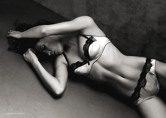
So this image is different, due to it being just one photo, black and white so no use of colours, though like the black and white image before, it does have quite a soft light, making the Tonal range quite varied, again from the bright whites of the bra, to the deep blacks also on the bra, these Blacks on both the Bra and Knickers really stand out, grab your eyes and they become the main focal point, as I assume this would of been a fashion shoot about the underwear.
Again quite a close crop/Frame to the image, i think that the way the model cuts through at a diagonal gives it a different yet appealing look, and I think the Connotation/Denotation of this image is very much "Sex sells" due not only the fact that it's a woman in underwear lying down, but also the expression on her face seem to lead the train of thought that way.

This image is 2 Photo's both in colour. The range of colours is fairly wide, there are Whites, Blacks, Blues, Yellows, Purples, Pinks etc.
The Framing of both of these images is wider than the previous, to allow you to see the props that the model is holding/has around her, yet still tight enough to make sure that your attention is centred on the model and what she is doing with said props.
Not entirely sure what the Connotation/Denotation of these images is, if there is any at all, as again they were probably taken for a magazine/Advertising campaigns.
Depth of field in both images is middle of the range, so the model in the foreground is in focus, but also the walls behind in the background, are not completely out of focus.

This image is again in colour with a wide range of colours, Blacks, Creams, Whites, Blues, Purples, and even a tiny bit of yellow on the models fingernails.
Again I would say this would of been taken for a fashion shoot/advertising, so the focal point is on the model and the dress that she is wearing, with another Denotation of sex sells, with the model having something in her mouth, and blowing on it and there being a bed in the background.
The framing of this image again even wider than the previous images, and I think this is to allow the whole of the dress to be seen.
Even though there is a wide frame the Composition of the image is still a simple one with only a few things making up the complete photo, but there is a use of 3-4 different textures.

This image is again 2 photos together to make 1 photo, this time both are in colour, though the blue lighting makes them almost look black and white, and narrows the Range of colours. The range is white, black, blue/ grey and then the models skin tone.
I think using the table as a prop has given the images a use of lines and angles, in the image on the left there is the table, the line between the floor and the back wall, and then models arms and 1 leg are straight, and the other leg bent at just over a 90 degree Angle, giving 2 more lines.
Then the image on the right again has the table and it's leg creating 2 more lines and a 90 degree angle, the models arm is bent to a similar just over 90 degree again, and her hair is also hanging straight down, with the white high lights creating yet more lines.
Both images again use a middle to deep Depth of field, in order to allow the model to be in focus and the main focal point, but the detail/pattern in the back wall is also in focus.
The composition of these to images, isn't very complicated, but the mix of the colour in the hair, the table and the detail on the background wall give it more composition than the photos below.

Again 2 photo's put together to make 1 Photo, the composition of these is a lot more simple than the other photo's I've looked at from Richard. just a plain white background, shot with a light either side of the model to produce 2 points of light.
The framing again is simple, definitely no use of the Rule of Two Thirds, as the model is middle front in both images. Again I would say shot for a fashion magazine or advertising campaign, so the Denotation is again Sex sells, and the images are all about the underwear/clothing.
The image on the left is cropped closer to allow you to see the detail/colours in the dress, where as the image on the right, has a different perspective, cropped wider, to allow the legs/stockings to be in shot. Both however again due to the nature for which the images would have been shot, make sure the model is the main Focal point.

This photo is Cropped/Framed much much closer than any of the previous images I have looked at from Richard. The framing has a banner of grey to the left, which I assume is to write about not just the jacket, but maybe also the Hair/Make-up, as the image is cropped closer around the models face.
Not a massive Tone/Colour range, 2 different shades of Grey, the colour of the jacket, which is also close to the models hair colour, and then the models skin tone and whiteness to the right of the models face.
Not sure if there is a Connotation/Denotation to this image, this one to me doesn't really use "sex sells" to me.
I would say there is a slight use of lines, with the line between the border on the left and the grey background, the line down the side and the sleeve of the jacket, and the curved line of the collar around the jawline of the model.

This image is again framed like the previous image, with a border to the left,more than likely for a write up on all the different components of the models outfit. Cropped wider to allow you to see all the components and the different pose used. I think due to lack of any stand out colours, Richard has used such a pose to really make the model stand out from the plain darkish background, and to grab the attention of the viewers eye. There is again little Colour or Tonal Range using just Whites, Blacks, Greys and the models skin tone. I would again say there is a use of lines, with the model having one leg up in the air, there becomes 4 lines (2 arms 2 legs) coming off the main body/middle of the image, all of which are leading out to the edges, I think this helps make the Composition a little more complicated, than just model stood up against a background.

This image is again 2 photo's together, but they have a massive difference in both the Crop, Contrast and the perspective. The one to the left is a wider crop, to allow the viewer to see the clothing, hat, neck wear, hair/make-up. Where as the one to the right is cropped a lot closer, to concentrate the main focal point to just the eye/make-up around the eye. The image to the left has a much brighter contrast using bright white clothing, and a White/light Grey background, with only the Black hat and neck wear to stand out and contrast it. Whereas the one to the right, Probably used the same background, but because the image is zoomed in more, the background has become darker and at the top of the image the hat is present, also causing a dark area, using just the models face as a contrast.

This is the final image I have chosen from Richard, It varies from the other as there is a lot more to the composition, there is the model, the puppet she is holding, the rug, steps, curtains. There is a fairly wide Tonal and Colour range, from the different colours on the puppet, and the rug. The contrast is well balanced, with no harsh or deep shadows or highlights. I think the main focal point is the Puppet, with the head looking at the model, this draws your attention to her and again the clothing she is wearing.
This image is also one that uses a few different textures, there is the rug, the wood of the puppet, and also the models skin.
I think there is a use of lines in the image. from the stripe of white down the centre of the top, the straight lines of strings, and then the lines of the legs and arms.
I think Richard as a general rule likes to use a studio, fairly soft lighting, simple compositions and props.
No comments:
Post a Comment